Logo

The symbol of Nedap

The Nedap logo is the most essential element of our identity. It represents both our human and technological side. We must use our logo carefully to achieve consistency in all our brand expressions. It is good practice to follow the guidelines below.

The Nedap logo consists of the brandmark and logotype, as seen in the inline version of the logo above. Besides the inline version there is a hero version of the logo. Read the guidelines below to familiarize yourself with the usage examples for the two different logo versions.

03.

Brandmark: The Spark

The Nedap Spark is our brandmark. The Spark symbolizes in different ways the way we work at Nedap.

It is our spark of inspiration, because we study markets and the people who work there. We gain valuable insights and connect the dots in our search to really understand what people need for them to become even better at what they do.

It is our spark of creation, because at Nedap we work closely together across disciplines to meet the professional needs of people. We create elegant solutions that are beautiful to look at and easy to use.

It is the spark of Nedap, because we use the power of technology to bring these solutions to life. We grow and scale our business to make a difference in countless workplaces around the world.

Nedap Logo Pack 2022
04.

Logo usage

Hero logo alignment

Can you use the logo in the middle of the page on the top or bottom? Then use the hero logo.

Allign the logo center with the middle of the page when the logo is placed at the top or bottom. See the examples below.

Inline logo alignment

Can’t use the hero logo, because the design doesn’t allow to use the logo in the middle on the top or bottom, then use the inline logo.

When the inline logo is used at the top of a page, the inline logo is aligned with the text as in the first example below. The Spark is aligned with te left aligned text on the page.

When using the inline logo at the bottom of the page, the right side of the letter P is aligned with the right side of the page, as in the second example below.

Spark logo alignment

Aligning the Spark is a careful effort. This is because the centre of gravity of the Spark is not in line with the center of the frame when the Spark is placed in a bounding box. This can be seen in the examples below.

The first example shows the correct alignment of the Spark, with the center of gravity of the figure aligned with the center of the page. The second example shows incorrect alignment of the Spark, where the center of the bounding box of the Spark is aligned with the center of the page.

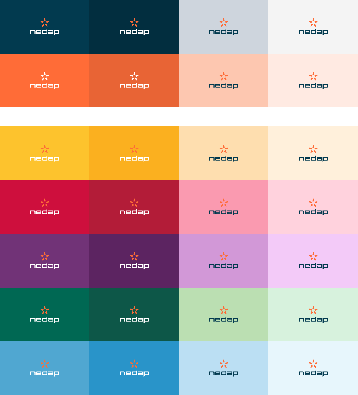
Background color / image

Ensure sufficient contrast when placing the logo or Spark on a photo or color background. Apply the logo where it appears clearly and legibly.

05.

Minimal size

Print size

Always use the logo as a supported element, it shouldn’t be too big and shouting. Do you really need to use the logo smaller then 15 mm? Then only use the Spark, but try to avoid this.

Digital size

This size is equivalent to the print size.

06.

Clear space

To make the logo stand out and to avoid conflicts with other elements it needs some clear space around it. The minimum clear space is the size of the spark. By using the same size as the logo, you’ll always be safe!

07.

Colour usage

Black and white

In cases where the 2-color logo is not appropriate or possible, use the logo in black or white.

08.

Logo crimes

To maintain the integrity of the Nedap logo, and to promote the consistency of the brand, do not misuse it. Some examples of logo crimes are listed below.

Do not modify the logo
The Nedap logo should never be redrawn, distorted, rotated, or added to.

Do not change the color
The Nedap logo likes to stay in the Nedap logo color palette. Don’t change the color of fill it with a pattern or a photo.

Do not use the wrong logo on backgrounds
Don’t apply the logo or spark without enough contrast or on crowded backgrounds. Select the right logo colour for the adequate contrast.

Do not add effects
Drop shadows, strokes, gradients and bevels don’t mix with the Nedap logo.

Do not mess with the Spark
There is only one Spark and it represents our company. Do not create patterns with it and do not modify it. Do not embed the Spark as part of infographics. Do not use it as decorative element.

09.

Signing applications

Building
For facade logo usage, use the hero logo. Centre and scale it proportional. Don’t make it too big and overdone. If you can’t use the hero logo, use the inline logo.

Trade shows
Always use the hero logo inside the booth as well for long distance communication.

On the big screen centre the hero logo.

By using the logo for long distance communication, use the hero logo in the middle of the panel and only use it once per side

10.

Applications clothing / sponsoring

Clothing
For clothing always use the hero logo.

Sponsoring
For sponsoring you can use the hero logo as much as possible. The hero logo will claim more space, which gives it more attention.

11.

Logo reveal movie