Typography

01.

Font families

Objectivity-Bold
AaBbCc01234
abcdefghijklmnopqrstuvwxyz
ABCDEFGHIJKLMNOPQRSTUVWXYZ
0123456789!?-
IBMPlexSans
AaBbCc01234
abcdefghijklmnopqrstuvwxyz
ABCDEFGHIJKLMNOPQRSTUVWXYZ
0123456789!?-
02.

Downloads

Select all
Objectivity
IBM Plex Sans
03.

Font usage

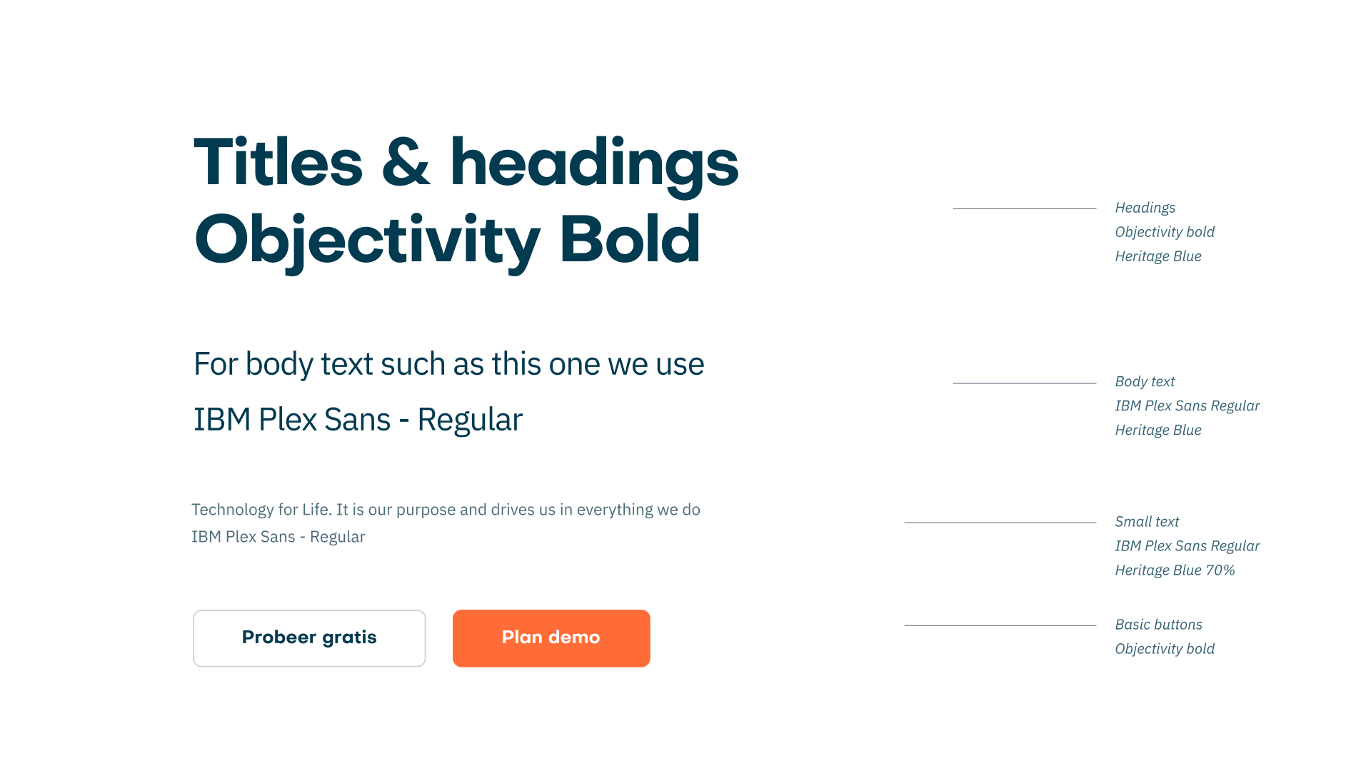
The general rule of thumb is: use Objectivity Bold for titles and headings and use IBM Plex Sans Regular for body text. If you stick to this, you can hardly go wrong.

Text should be left aligned without indentation. Experiment with placing left aligned copy anywhere on a page for flexibility.

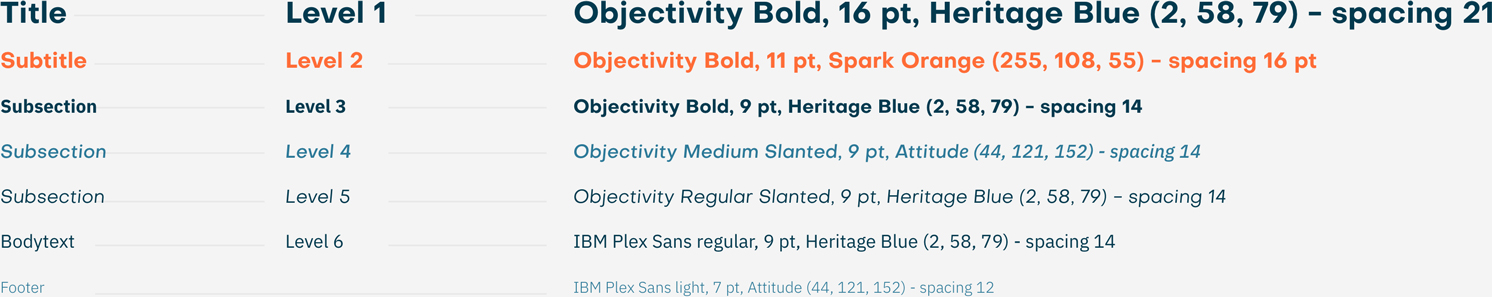
Paragraphs should be properly spaced. Details about font-sizes, letter spacing and hierarchy will follow soon enough.

04.

Font size

When you create an internal or external document in Word or InDesign, you can use the font sizes below.

05.

Examples

With just the typography, you can create a recognizable Nedap style. Below are examples, what you can do with mainly just typography and the colors from the palette.