Employer Branding

01.

Be the spark

At Nedap, “Be the Spark” represents your unique contribution as an employee. You are the spark that drives change and progress. We provide you with the freedom to innovate but also expect you to take action. We believe in your ideas and initiative.

We won’t tell you what to do; we expect you to take the lead. You know your goals and how to achieve them. “Be the Spark” motivates us to give our best and make a positive impact.

02.

People of Nedap

Nedap people are inclusive. We strive to bring out the diversity of talents and abilities, achieving its full potential in a sustainable way. We motivate and facilitate every employee and colleague to contribute to the operating result, based on their own ambitions and possibilities. Not by competing but by learning. Learning through ourselves and through others. Nor do we judge others based on stereotypes and prejudices. Nedap people are generally open and expressive and embrace the diversity of people and their ideas.

03.

Photography

Within corporate branding and through photography in particular, we want to emphasize and express this personality, mentality and corporate culture. We show a diversity of enthusiastic people who are surprised, excited, happy or moved by a compliment, a success or perhaps the great news of starting a new challenging job at Nedap.

As a group and as colleagues together, in photography we want to reflect our company ethos, our positivity and collegiality; always enthusiastic and proactive, never passive or holding back.

04.

Typography

For our employer branding we use the same corporate identity rules in typography overall, no exceptions or adjustments. The campaign title ‘Be the spark’ is a graphic element that is used in the same way everywhere: two lines in Objectivity Bold, in accordance with the corporate identity. The same rules apply to the other titles such as Be the cause etc.


05.

Layout

Rules and guidelines for Nedap’s corporate identity such as color, typography and layout also apply to Nedap Employer Branding. There are no exceptions. However, there are a view applications within these guidelines that are specific to Employer Branding, as described here.

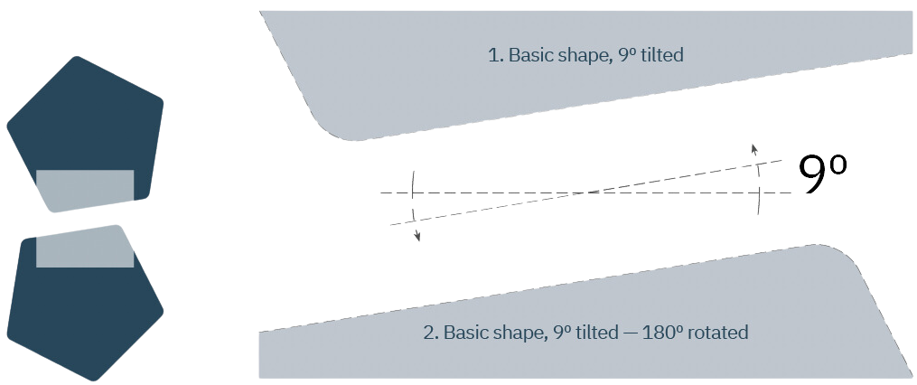
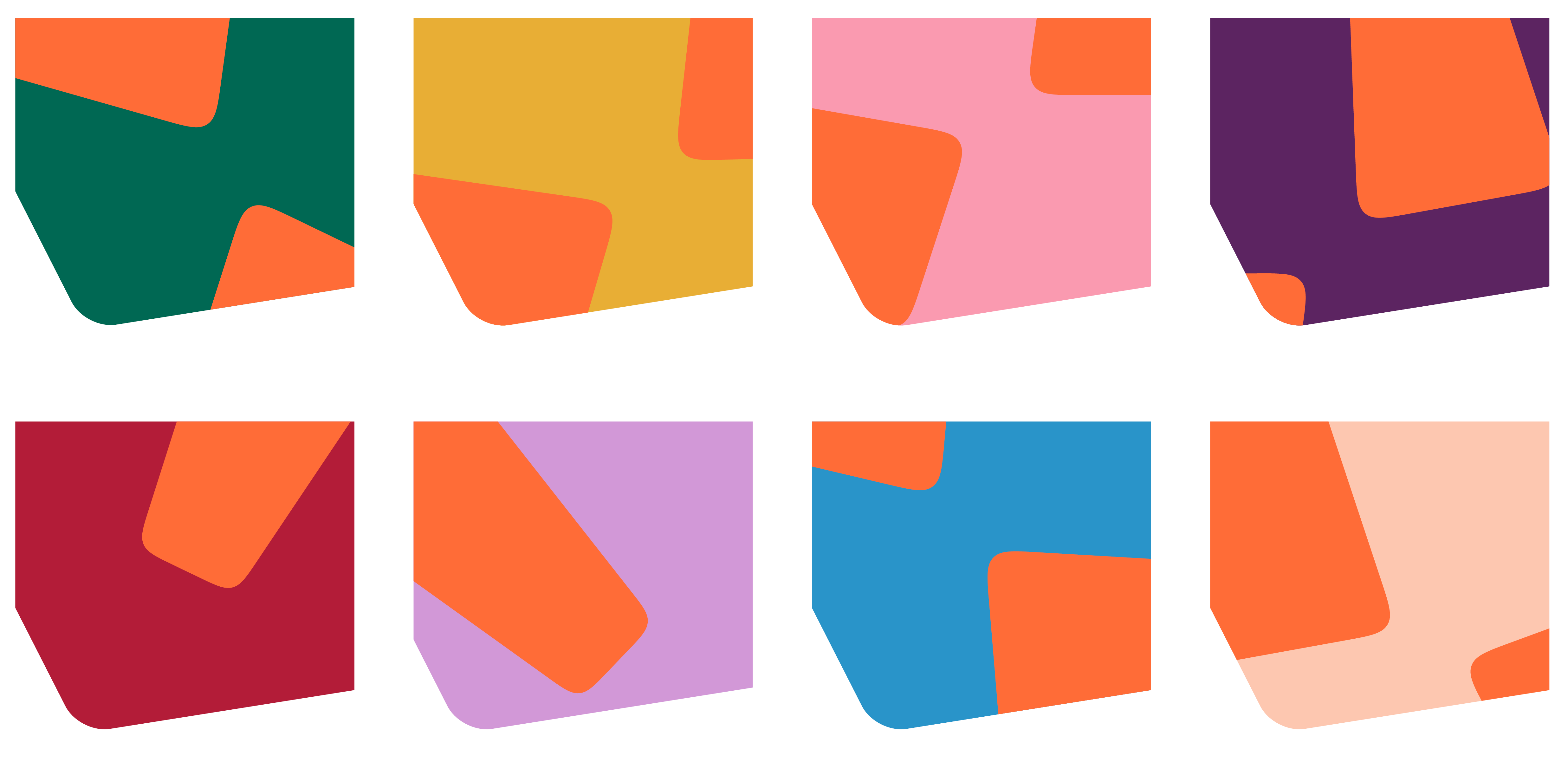
Main use of the basic shape system, specific for employer branding

To keep it simple, we’ll stick with the shape of the rounded pentagram; the basics of our design / shape system. However, we tilted this shape by 9° to make it more applicable and a little more exciting. We use this primary application for all campaign images and main visuals.

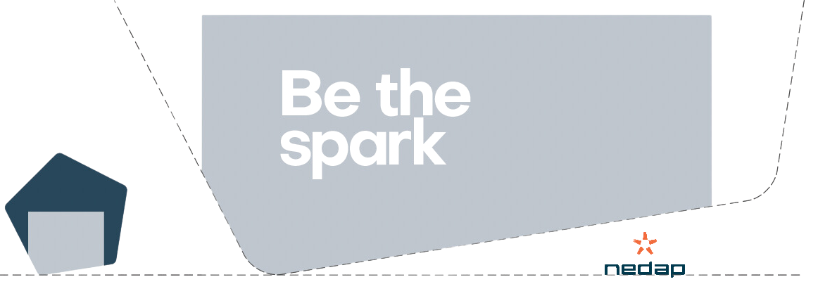
Second possible application

By rotating the tilted shape by 180º it fits nicely with the tilted basic shape and it remains simple and straight forward. Together, these are the two default options to apply the basic shape system when used for Nedap recruitment.

06.

Colours and background colours

A selection of colours has been made especially for Nedap Employer Branding, coming from the existing primary, secondary and expressive corporate color palette, to be used as a background for the portraits to be photographed. For all other applications, the corporate house style rules regarding colors and their application apply unchanged.

The orange spark has been cropped and positioned over the colored backgrounds so that only a small but recognizable part of the spark is visible. The original orange colour or the individual components of the spark may not be edited or modified. Together they form the ‘decor’ of the characters. The characters are photographed against a white background, made free-standing in post-processing and placed in front of the colored backgrounds with parts of the spark. Only the shadows of the characters may affect some of the colored backgrounds or spark for a more natural appearance.

Backgrounds with cropped parts of the spark.

Portraits on final backgrounds.

07.

Examples